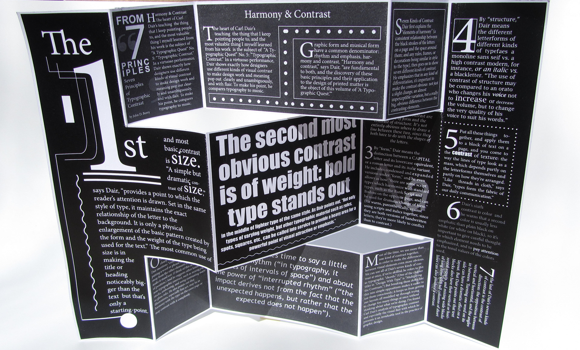
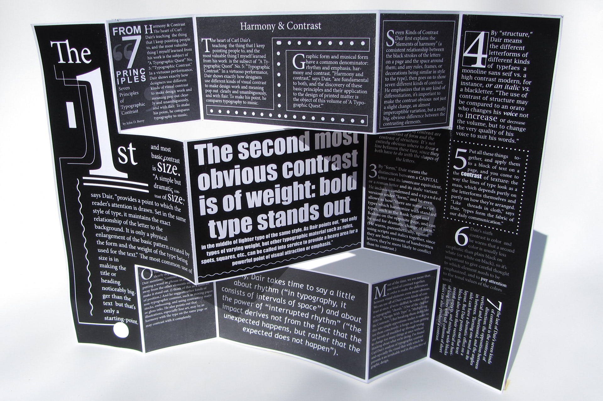
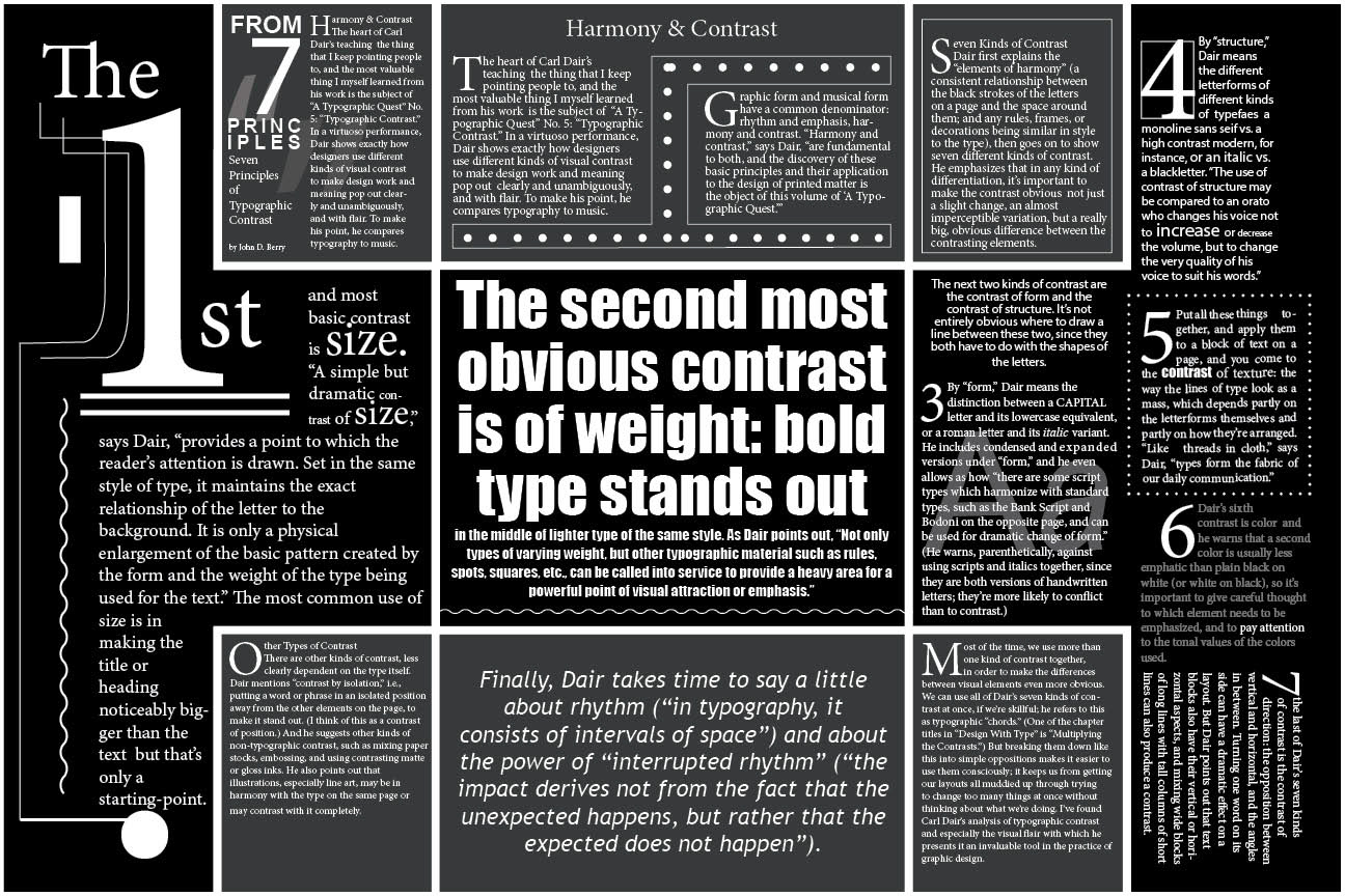
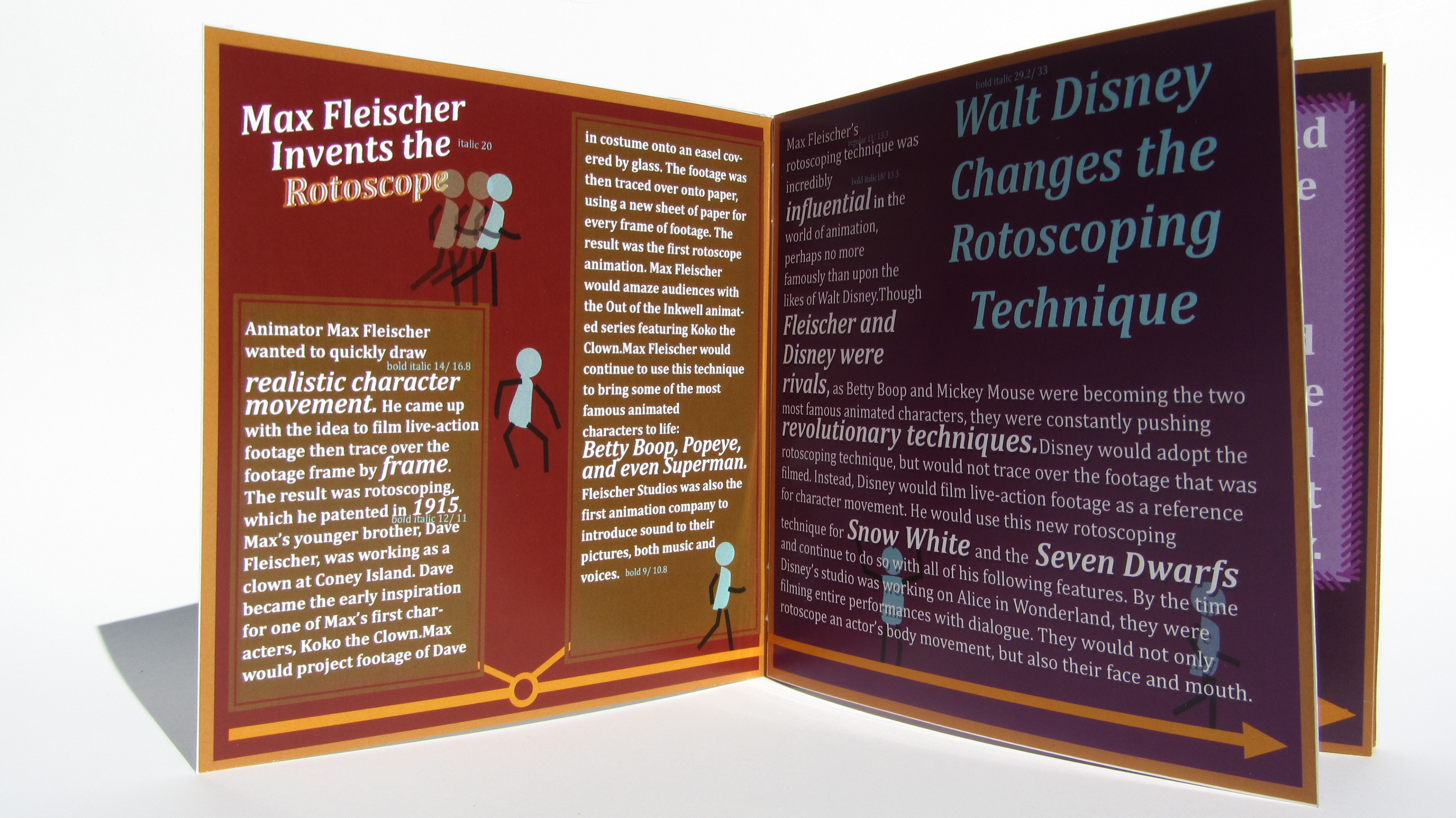
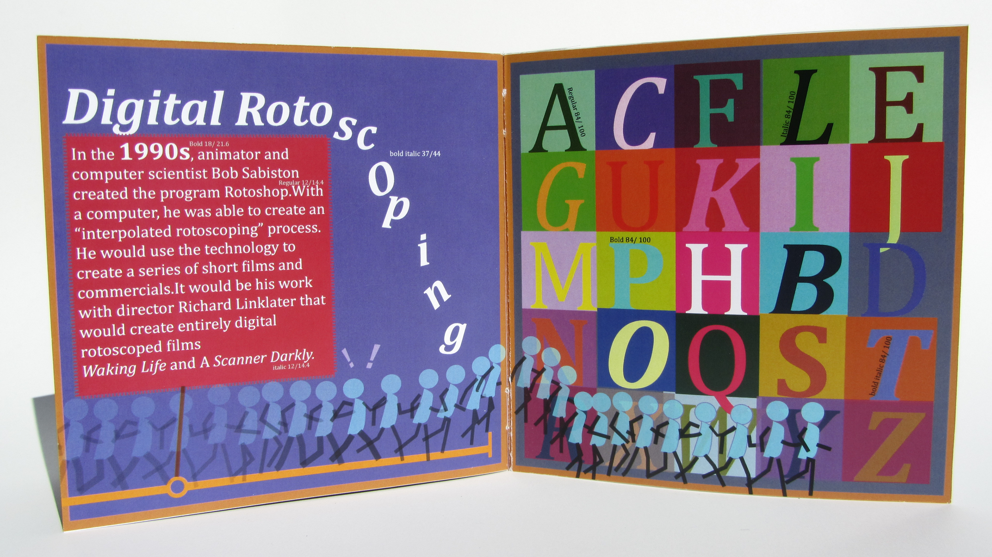
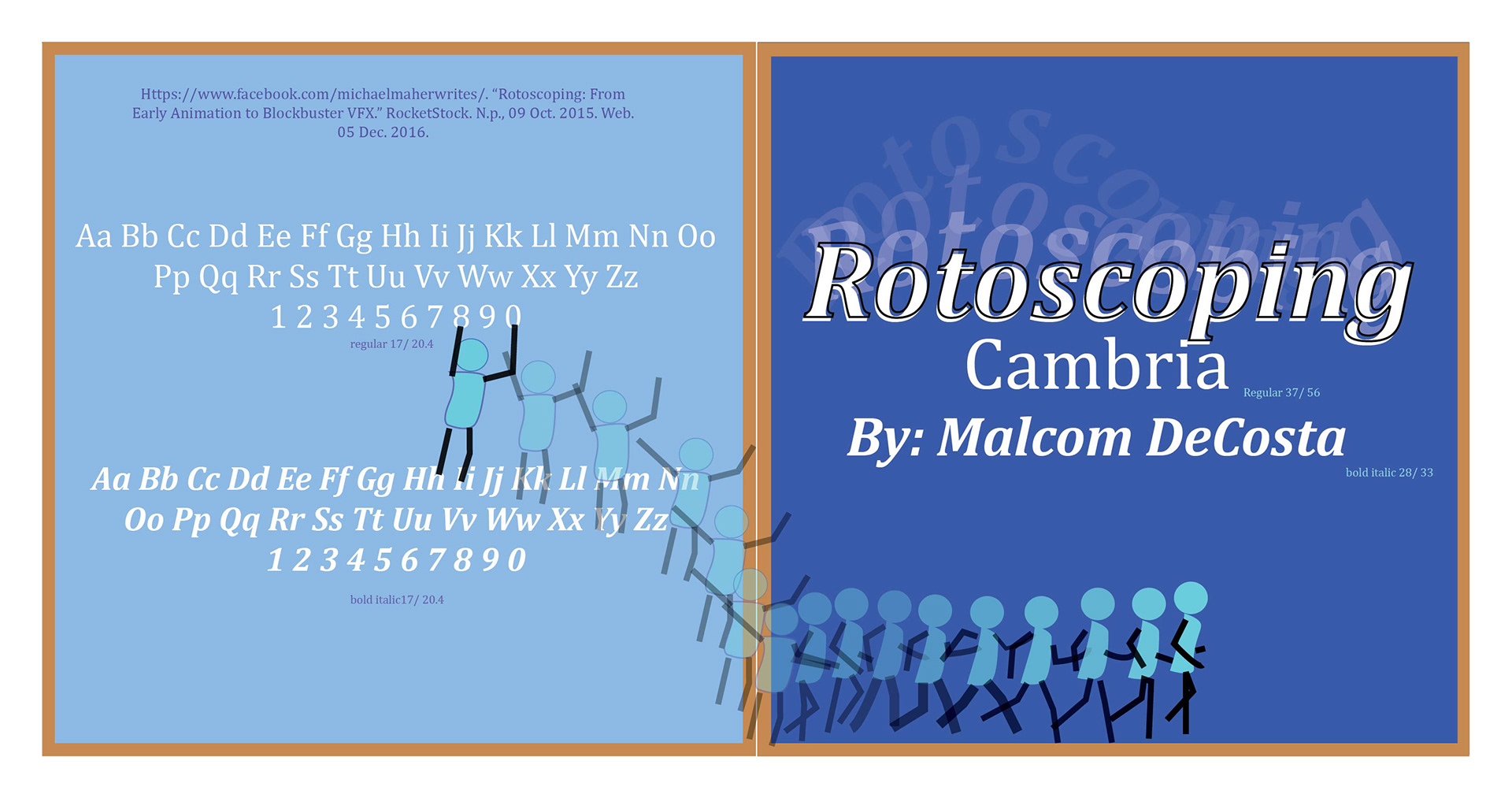
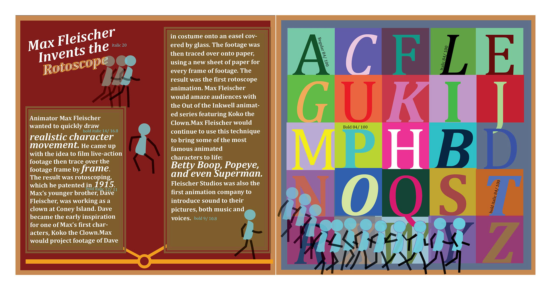
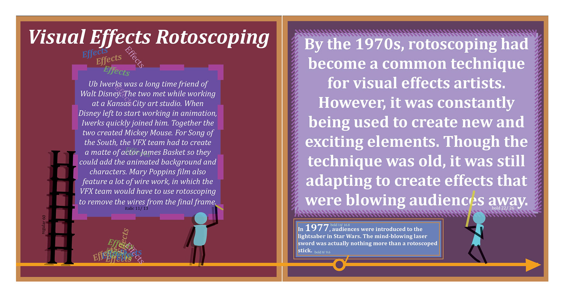
This is a poster I made discussing the harmony and contrast of type. This discusses how type works and functions.

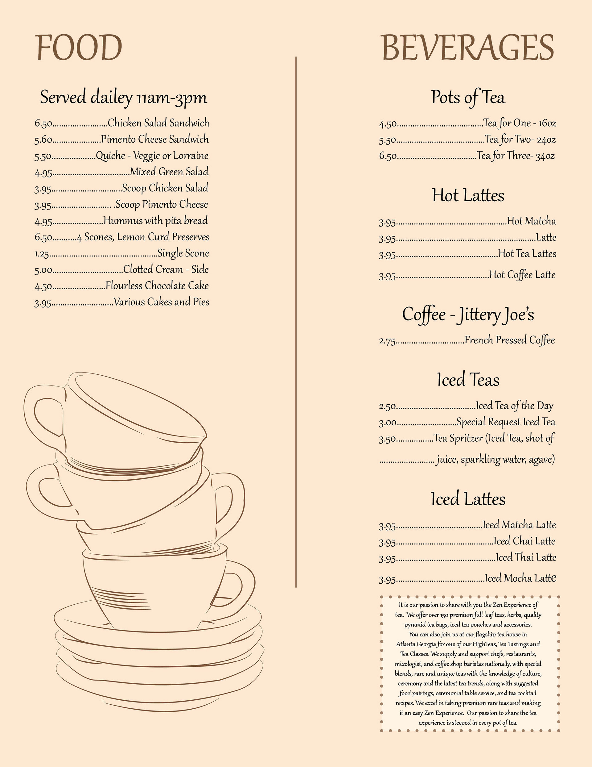
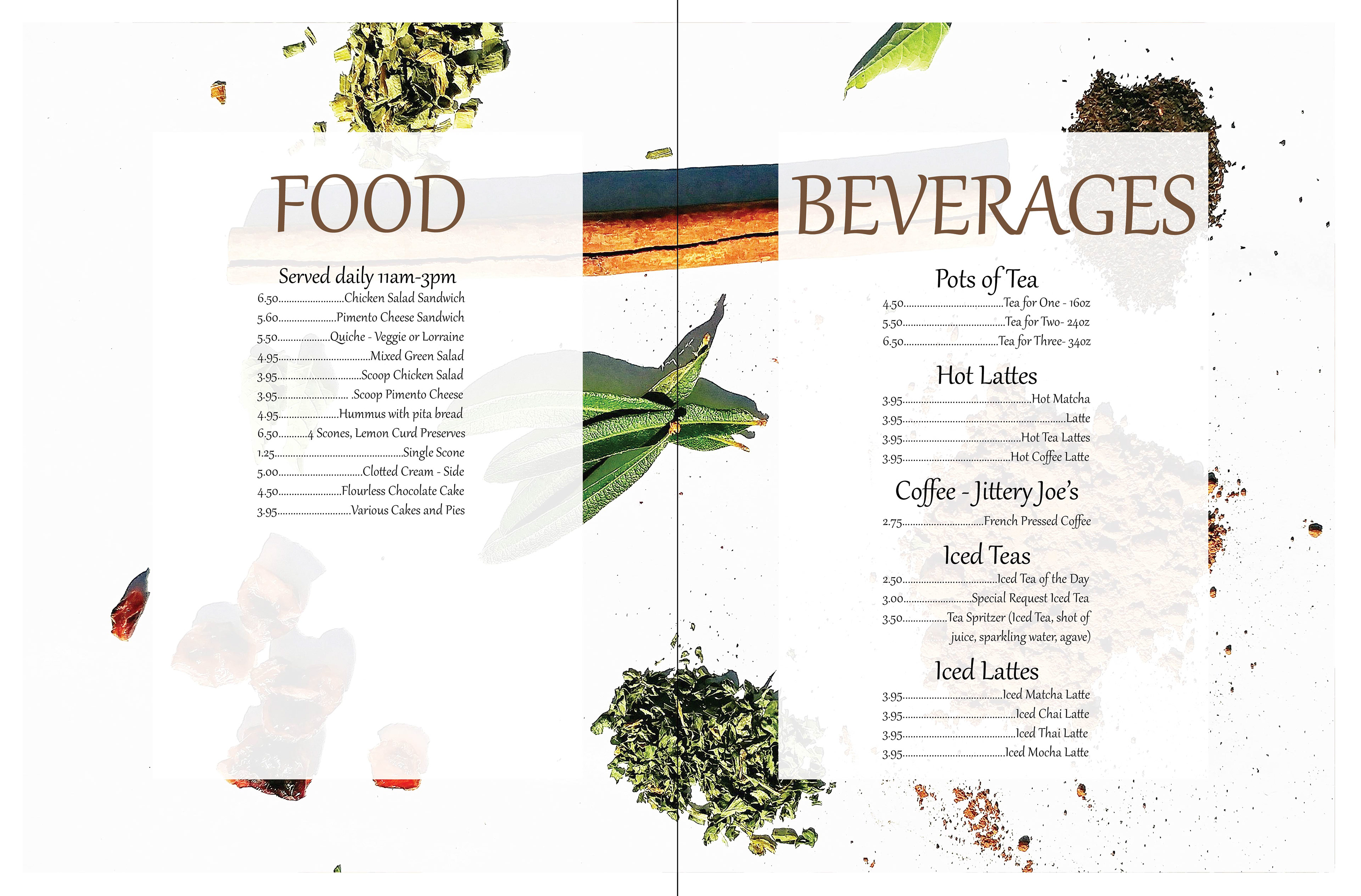
For my class assignment I was given the task to redesign a menu for a local shop. I chose to do Zen Tea (a small shop that sells a variety of teas and foods). Here are 2 different variations. One is illustrated while the other is done through photogrophy.